
By Dax Speakman – Syracuse University ’21
Introduction
The NBA Bubble was an experimental idea conceived by the NBA to safely continue the 2020 NBA season amidst COVID-19 and crown a rightful champion. The Bubble cost the NBA $180 million to set up and operate in order for the league to finish the regular season and have a full postseason, which resulted in 172 games played over roughly 100 days.
The Bubble brought along with it a number changes to the environment of the NBA. Obviously, it is still the same game where the objective is to score more points than your opponent. However, there are certain elements to a normal NBA season that make each game unique, and the Bubble changed up the usual patterns present in these games. It created an environment where there is no home court advantage, no crowd, and no travel.
These are some of the elements I will aim to explain the impact of between the NBA before the bubble and during the Bubble.
As a barometer, I will use gambling data collected from covers.com to see the changes in pace of play and projected scoring differential between the two time frames.
Data
• Attendance:
• Atteendance for each game
• Basketball-reference.com
• Travel:
• Number of miles traveled
• Road win percentage
• Total points scored
• Teamrankings.com
• Nbasavant.com
• Injuries
• All reported injuries from 2010-2020
• Kaggle.com
• Referees:
• Individual statistics
• Separated by regular season/playoffs
• Basketball-reference.com
Attendance
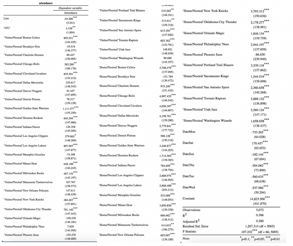
In the regression below, I observed the effects the line, over/under, visiting team, home team, and day of the week had on the attendance for each game. As expected, fans would prefer to see a game where the favorite has a much larger spread in their favor shown by the -44.286 significant at the .001% level. The negative coefficient indicates a larger favor for the home team, indicating more fan support for better, winning teams. Fans also love when a game is expected to score more points as that has a positive, significant effect on the attendance for a game. These two variables also go hand in hand with the team variables that are significant in this model. Visiting teams that affect the model are teams that have had a “super team” which has become a recent trend in the NBA with the Warriors five-year dynasty and big 3’s like the LeBron James Heat, LeBron James/ Kyrie Irving Cavaliers and the young trio of Durant, Harden, and Westbrook in Oklahoma City. Or even teams with exciting star players like Lillard in Portland or Giannis in Milwaukee. Also, teams that generally score a lot of points and have a strong fan base that travels well like the Celtics, Bulls, Knicks, and Blazers have proven to have a strong, positive effect on the attendance of a given game.
Travel
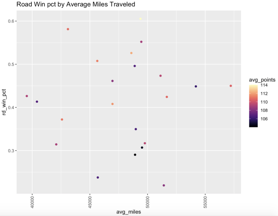
Common sense would lead you to believe that the more a team travels, the worse they will play on the court. However, this graph leads us to an outcome that goes against that reasoning and my hypothesis that the more teams travel, the worse they do on the road and the less points they score. By looking at the first four points on the left side of the graph, I see that those teams are in the average for points scored and sit in the lower third tier of winning percentage despite being the teams with the least amount of travel. Conversely, the team all the way on the right with the most miles traveled has a high number of points scored compared to the rest of the teams and a win percentage right on the upper bound of the middle third tier in win percentage. To look deeper into the effects of travel on a team, I ran an OLS model attempting to quantify these effects. I found that the amount a team travels does not have an effect on the team’s success on the road. There is no significant evidence that the average miles traveled by each team per season had any effect on their success on the road.
Injuries
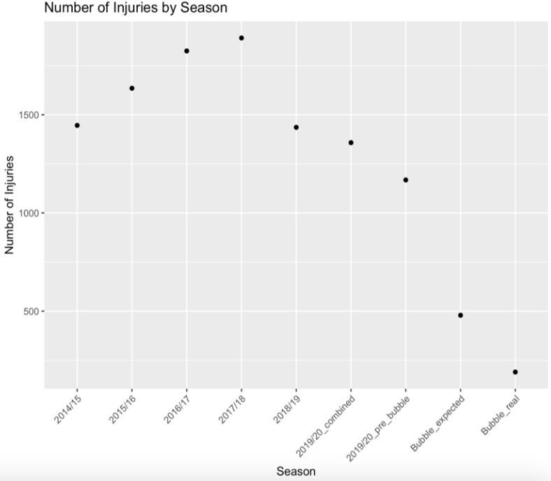
Over the four-season span from 2014 to 2018, there was a steady increase of injuries in the NBA. Every season that goes by, the game of basketball gets more physical and becomes more of a contact sport. The athletes get better and better, and the game is played at much higher pace. This, in turn, leads to more injuries being sustained by players. However, an interesting turn took place between the 2017-2018 and 2018-2019 seasons. The number of injuries dove to a lower number than they were in 2014, at the beginning of the rise. This can be accredited to two main reasons that took effect at the start of that season. First, the NBA started its multi- season phase of limiting back-to-back games that teams played and giving teams extra time to travel. The change eliminates ”four-in-fives” and limits back-to-back games for every team. The second factor impacting the decrease in injury is the strategy of “load management” which began to take hold that season. Players take days off, which enables them to be on the floor for more games and gives their team more opportunity to play true to form.
Based on the trajectory that the NBA was on with the number of injuries that had been reported from the start of the 2019-2020 season up until March 11th, when the NBA was postponed indefinitely, I expected there to be 1900 injuries reported. The NBA ended up with 1600, meaning only 200 injuries reported in the Bubble compared to the expected 500. This drastic drop in injuries can be explained by the lack of travel and playing time for each team.
Referees
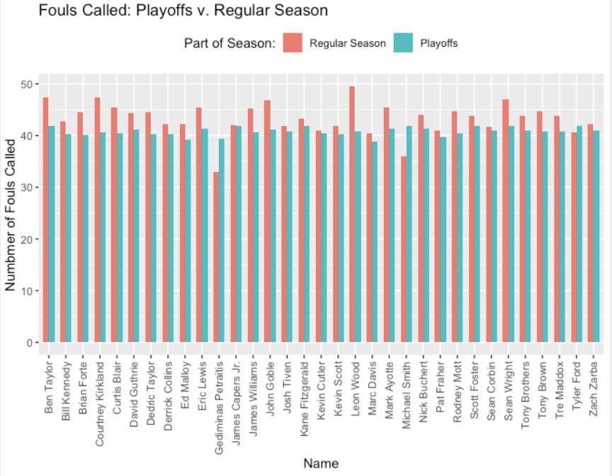
Just like any sport, referees have a major impact in what happens during a given game and can be the deciding factor on the outcome. One measure for referees that is commonly analyzed is the number of fouls called during an average game. To check the effect the bubble had on the referees, I analyzed whether the referees changed their tendencies in how many fouls they called. Based on the graph below, it is clear that most referees have different tendencies in the playoffs. Whether it was calling more or less fouls, I expect this to have an effect on the over/under trends in the Bubble versus outside of it.
Conclusions
Pre-bubble Over/Under cover differential: 1.91 points over
Under: 49.55%
Over: 49.39%
Push: 1.06%
Bubble Over/Under cover differential: 0.499 points over
Under: 49.42%
Over: 48.84%
Push: 1.74%
Pre-bubble line cover differential: covered by 0.05 points
Covered: 49.93%
Not Covered: 48.86%
Push: 1.72%
Bubble Line cover differential: covered by 0.70 points
Covered: 49.42%
Not Covered: 48.26%
Push: 2.33%
With the average over/under differential being closer to 0, this suggests that the teams played more true to form and the points scored went down as expected as based on the attendance model. Since the line covered at a similar rate, it suggests that the bubble got rid of factors that led a team to under or over perform.